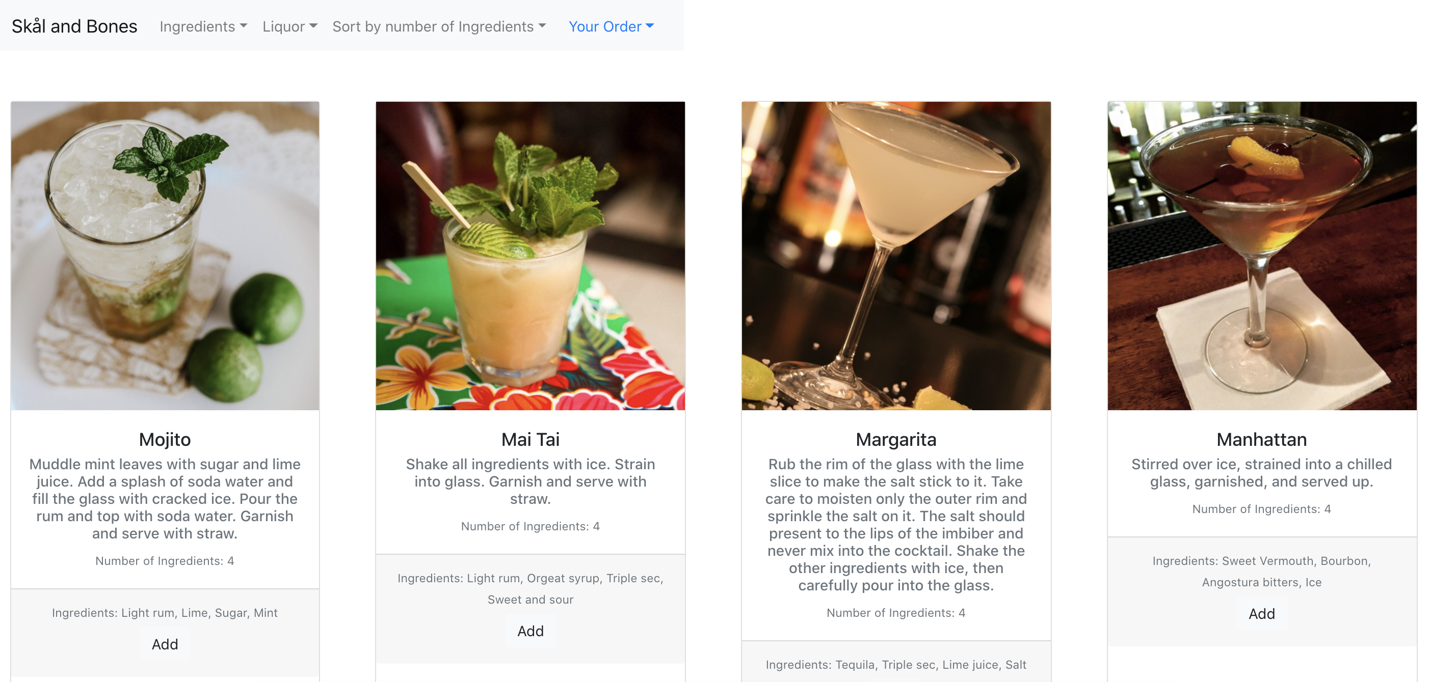
I have created a website listing of beverage recipes. One of the key data pieces shown is the
instructions for making the beverage. Users can find their desired drink through filtering by
liquor type and ingredients, and add to cart. The aggregator in the cart showing the total
number of ingredients could be helpful for a shopping trip, in the case that the user wants to
make a series of drinks that week and wants to plan ahead for the ingredients she will need. The
next-step feature would be for the ingredients list to have specific units of each ingredient.
WHEN: 2020
CLIENT: minimum.eco
ROLE: UIUX, prototype
TOOLS: Figma, UserTesting