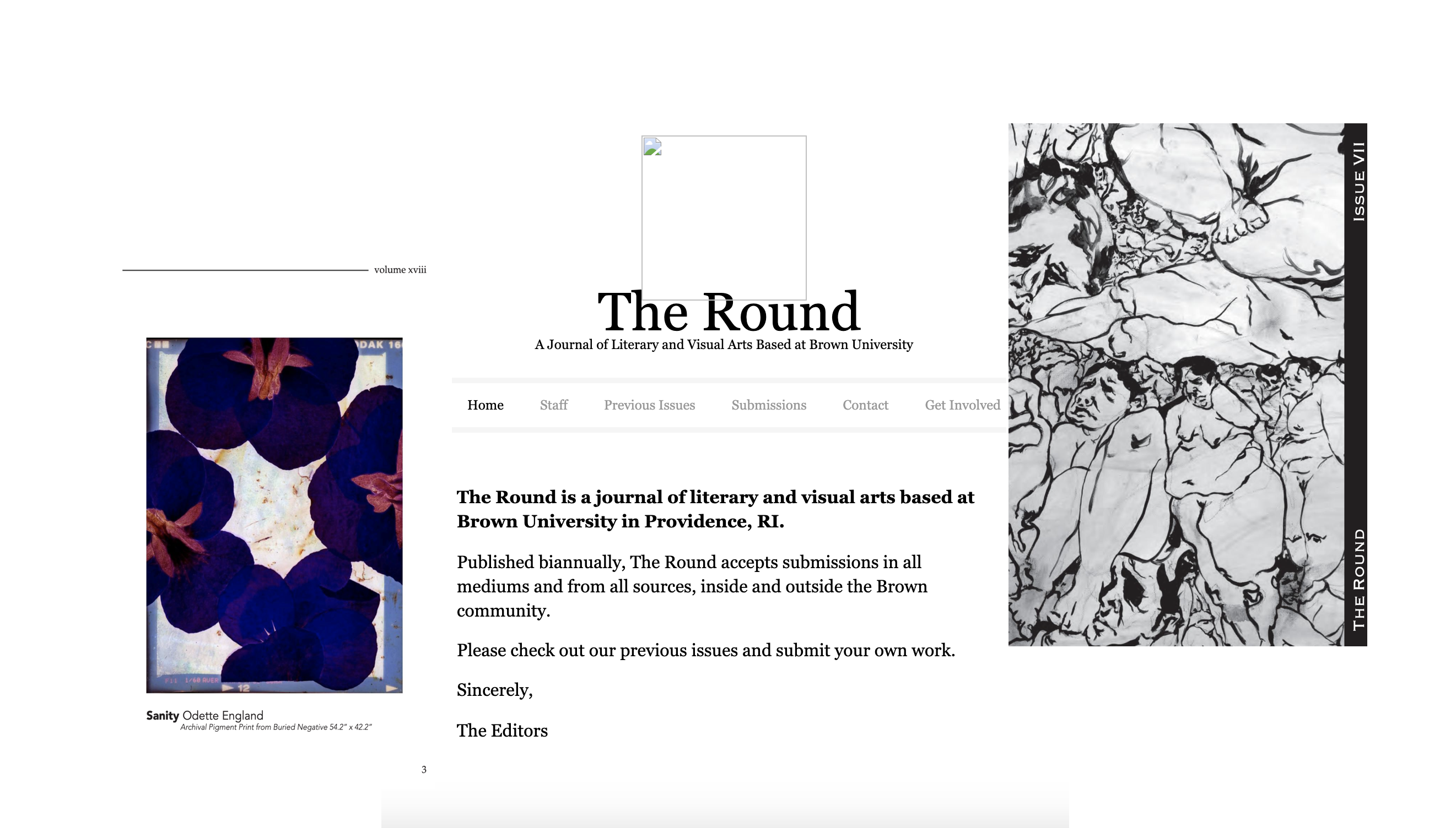
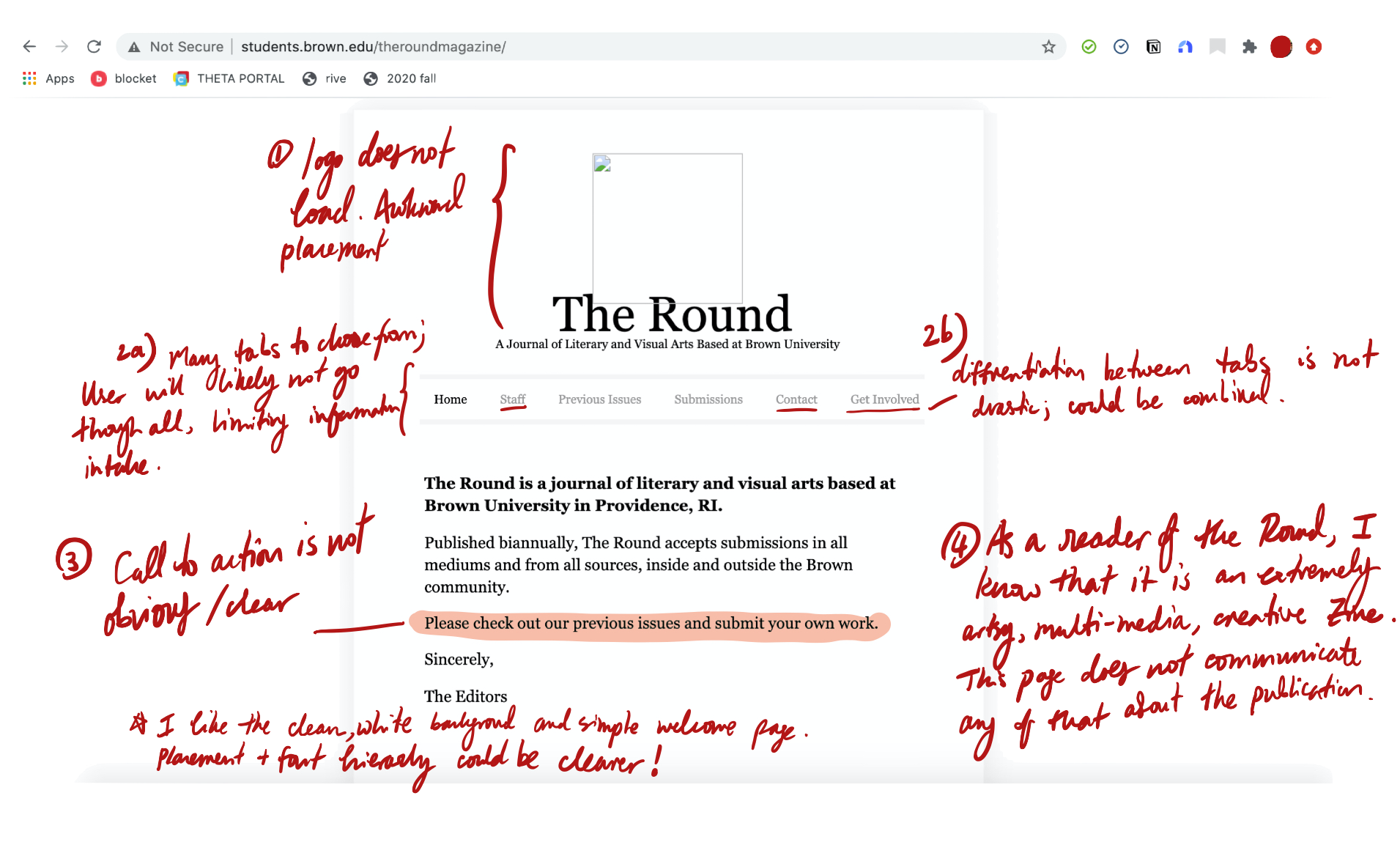
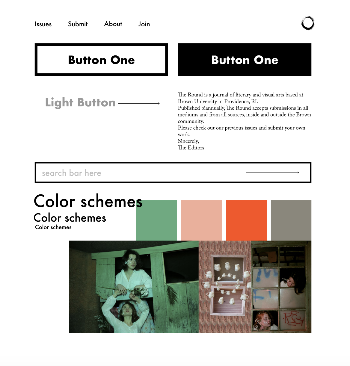
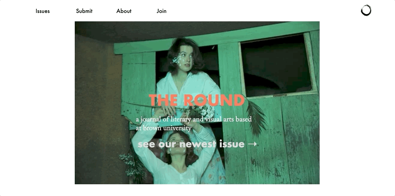
The Round is a journal of literary and visual arts based at Brown University in Providence, RI.
Published biannually. As a reader, I was surprised by how under-developed their website was,
especially considering how hip and edgy the aesthetic
of the published Zine is. As a result, I've set out to Responsively Redesign the website for The
Round.
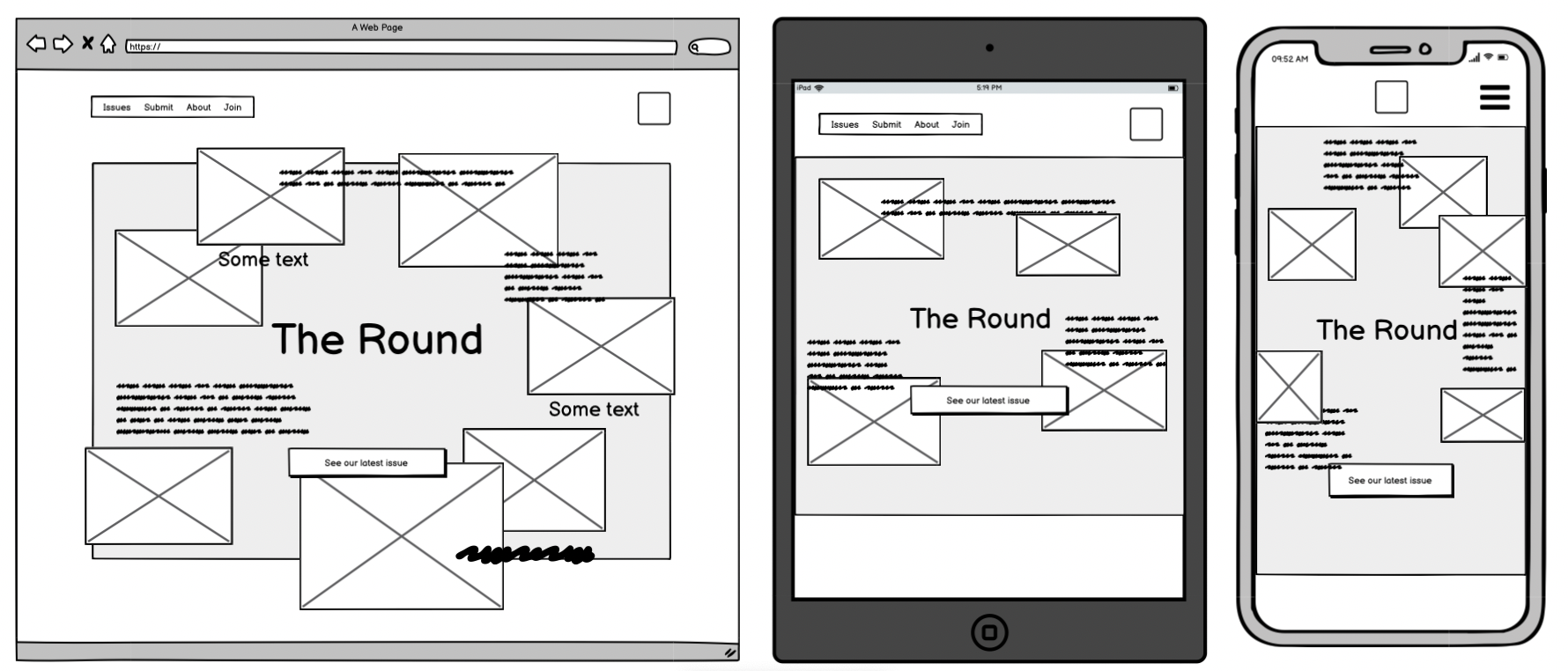
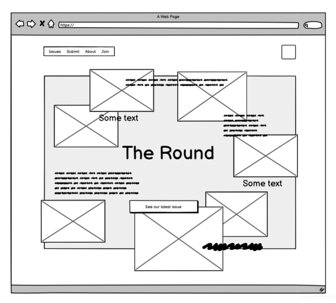
WHEN: 2020
CLIENT: The Round Magazine
ROLE: UIUX, prototype
TOOLS: Figma, HTML, CSS